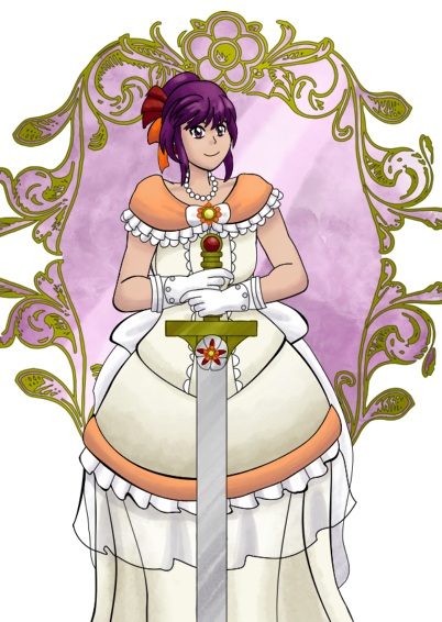
Two of the illustrations for Extra! Chronicles were the perfect opportunity to make a tutorial about how I do illustrations with digital painting effects!
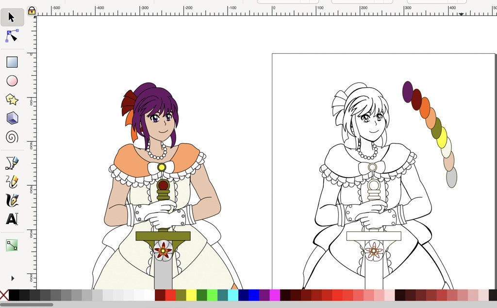
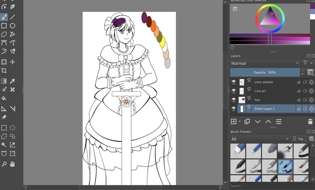
I use Inkscape for vector graphics and Krita for bitmaps. These techniques can be done with just the brushes that Krita includes by default.
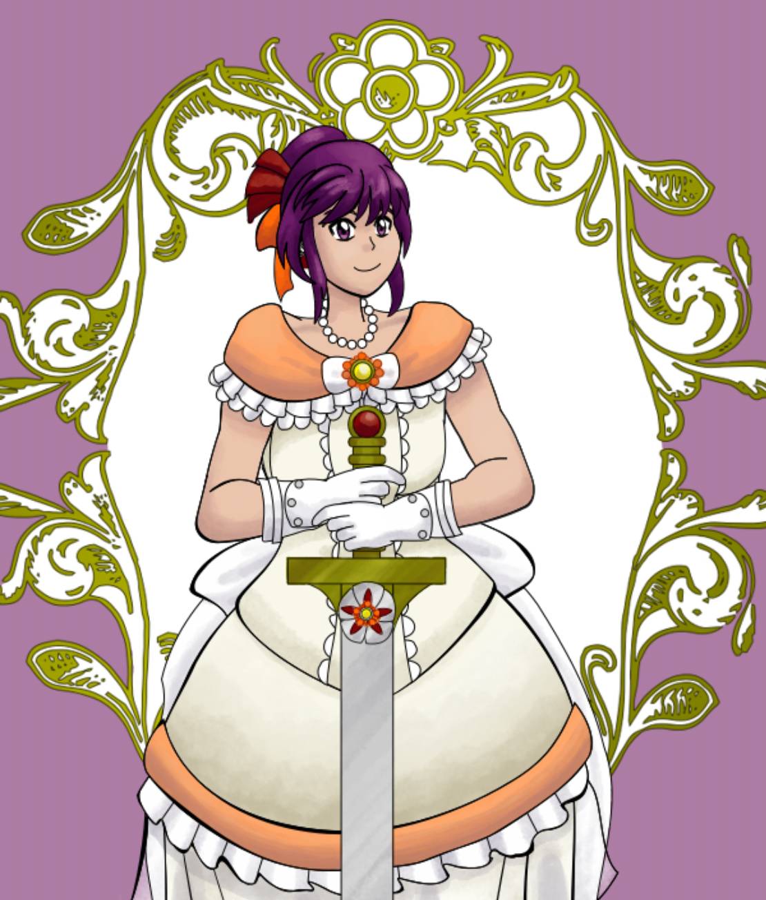
The line art can be made in either of these programs. When I draw it in Inkscape as I did for this illustration, I like to make a color map that lays out all of the base colors. The color map will be used as a reference. Creating the line art as vectors will allow it to be resized without any loss in quality before exporting it.
Make a copy of the line art with base colors and move it to the side. This will be the color map.
Change the fill of the original to make it all white, and export it as a .PNG.
Open the line art in a bitmap program. For this, I used Krita. Set the line art layer to Multiply, and put the layers for the coloring and background below it. Multiply makes everything white in the layer transparent so you can color in layers underneath it without affecting the line art.
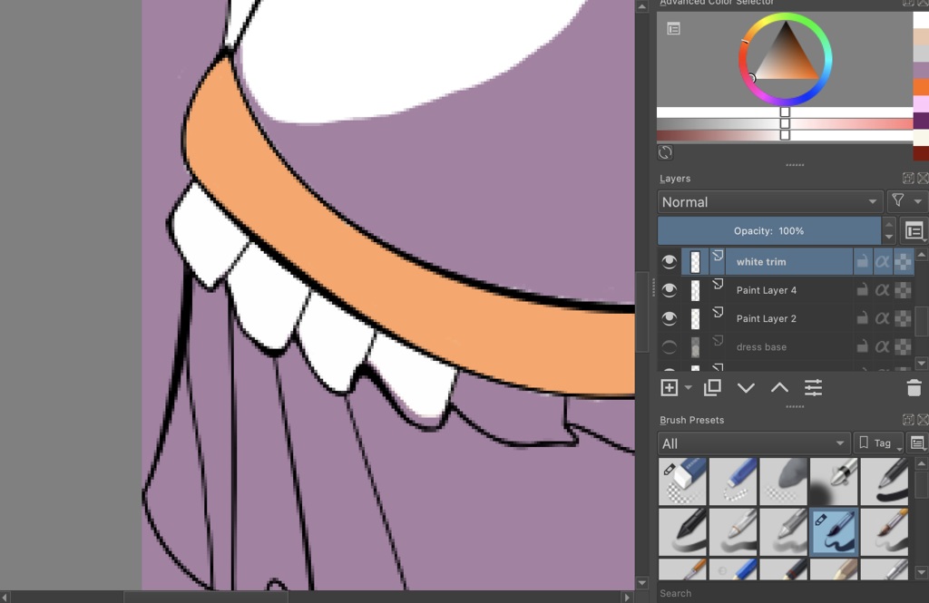
Create a layer that'll be below all of the layers to fill with a temporary solid color. This layer will help you catch spots of light colors that were missed when you're filling in the base colors. It can be removed when you're finished with the base coloring. This color should be dark enough to contrast with light colors. I'd recommend a subdued color.
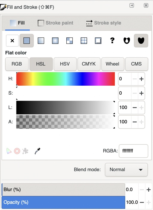
The Advanced Color Selector is helpful when selecting colors! The color wheel selects from the range of hues. Inside the wheel is a triangle to select from colors that range in brightness and saturation of the selected hue.
The edges of the color triangle are also a continuum, as is the area of tones inside the triangle:
The temporary background color that's closer to the left edge with a medium brightness and value.
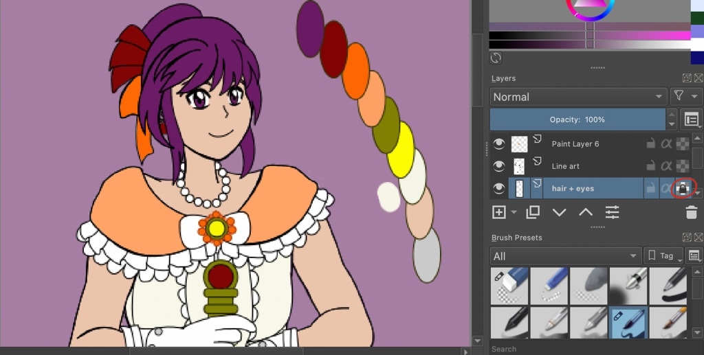
I use several layers for the base coloring. The first one I started was for the hair. Naming new layers as soon as you make them will save time later. I've colored several illustrations that had more than 20 layers that just had numbers, and it was a time waster trying to sift through the layers to find which one I needed to edit, hide, remove or merge! ^^;
There aren't hard and fast rules for when to create a new layer, but I started with a new layer for the character's hair and eyes. I used multiple layers to color her outfit, jewelry and sword:
This shows off more of the layers. Creating new layers prevents coloring that goes out of the lines from affecting it on any other layer. The layers can be merged as needed!
Duplicating the selected layer (Cmd + J) and alpha locking the duplicate is a method to paint shading and highlights without going outside of the base coloring. The alpha-locked duplicate is the layer to paint them on, and the original layer could be saved below it as a backup in case you needed to start over shading. I hide the original layer so it's not in use and that kept me from accidentally coloring on it and wondering why I can't see the changes.
Don't mind that the details on this character's brooch changed between screenshots. My production process sometimes has me making last-minute changes! :P
I started with shading the hair by duplicating the hair and eyes layer and alpha-locking it.
For most things, I choose shading colors that are darker than the base color, but also have cooler hues on the color wheel. This character's hair has shading that's closer to a dark purple or violet hue. The base hue of her hair is closer to magenta. Under most lighting, I use a reddish-brown color to shade skin.
Highlights are lighter but have warmer hues on the color wheel, so the highlights of this character's hair will be pinkish.
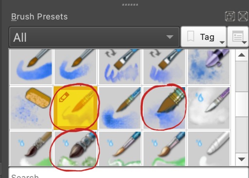
The brushes that are circled in red are the ones I used the most. Each of these brushes produce a specific painting effect, and the one that's highlighted in yellow is the one that I used for most of the shading.
Highlights can be placed on the same layer or a new layer above the shading. I tend to put them in a new layer and merge them. When I'm sure I don't need the backup layer that had just the base coloring on it, I delete those to make the layer list less cluttered.
The final image has a simple watercolor background, but I used the same base color technique. Since it doesn't take up the entire image, it needed to be confined. This background would be in a new layer above the temporary background color layer, but below the rest of the layers.
I filled in the area that'd contain the background, duplicated that layer, alpha-locked the duplicate and continued coloring in it.