

I was introduced to this challenge on Tapas when I was looking for a challenge to do for October. This challenge that ran for October 2022, and the objective is very simple: Work on a comic or webtoon for at least 30 minutes each day. Barring any days I'm away from my computer all day, I already meet that goal! Why would I take this challenge then? I took it up to focus on the progress that I could make, to share my enthusiasm with others, and it was an opportunity to write a lot about the production process.
The production notes section on the Magical Renegades page was also written during this time. Drafting it and this page helped me write both of them! This is one of the times that juggling projects was helpful!
At the start of the month:
Although the month and this challenge started in the middle of an episode, the timing felt perfect in another way. It was the start of October, and this episode starts ghost characters!
At the end of the month:
The challenge is still ongoing, but some milestones have been reached: Completed episode 30, wrote the script for the new parts of episode 31, and drew the sketches for the new parts of episode 31.
Posted this WIP. The context for it is that the ghosts are making a stand-up comedy performance, and McCool (the ghost in the tuxedo) needed some notes, but Catherine (the other ghost) handed him the wrong ones!
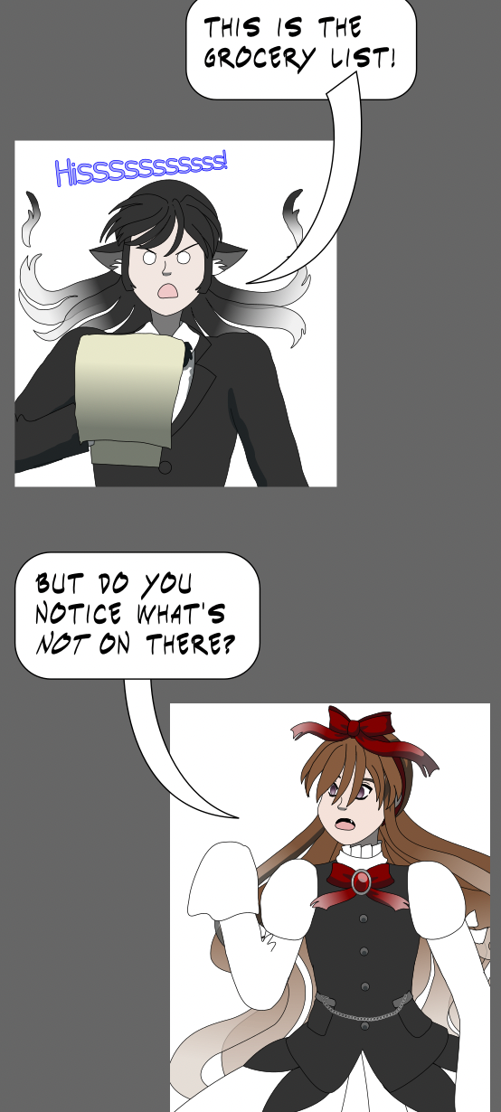
Adjusted the lighting on the ceiling and stage to create renders of them with reduced lighting. The ceiling lights and the lights on the stage changed color for a dramatic effect!
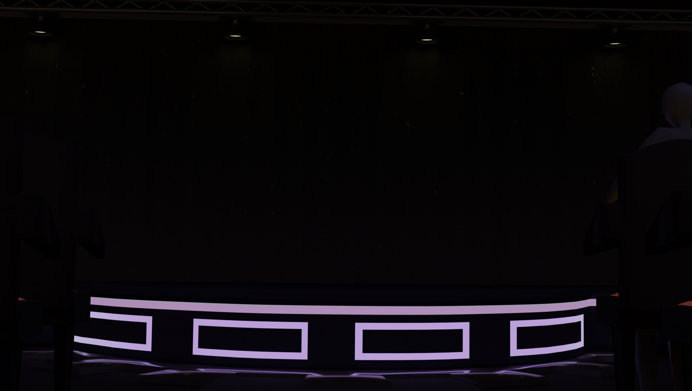
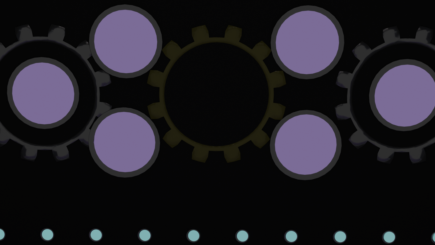
Adjusting the lighting on them was easy. A swap of colors and removing the spotlight objects that were below each of the lights on the ceiling and stage. The lights along the stage were adjusted through the ColorRamp node!
Added those backgrounds I rendered into the episode, and vectored this panel:
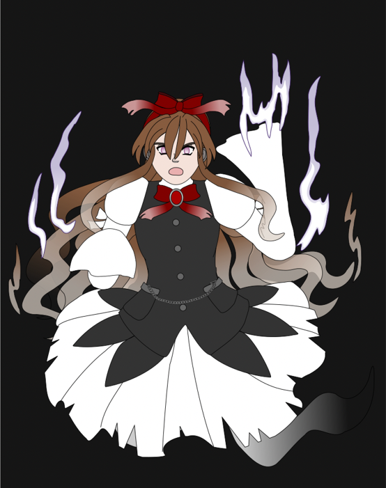
The last 2 backgrounds set the stage for a scarier tone as Catherine might be setting up for a ghost story, or an ominous warning? This'll be revealed in the episode or a WIP!
Arranged a few panels, added the text and speech balloons for those panels, and modeled a machine that’ll be a prop on the stage!
Rendered a shot of the machine on the stage, and a close-up of it. Edited them and two other rendered backgrounds in Krita to blend them in with the art style. Added them to the episode.
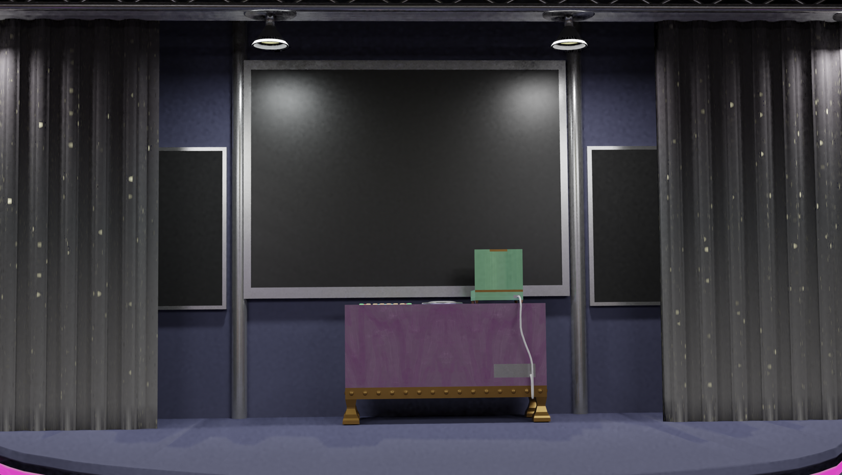
This is the render of the machine. It's a steampunk-inspired computer but has glowing buttons on it like a lot of 1960’s sci-fi computers!
I manually smoothed out the graininess in that render when I painted the line art and blended the shading for it.
There were technical difficulties this day! T_T
Started to edit a render to draw in the line art and paint in the crowd (the crowd were just rendered like mannequins which were going to be painted over) until my iPad suddenly dropped connection and I couldn’t reconnect through Sidecar!
It was frustrating but could've been worse; I was able to complete the line art and most of the base coloring of the painted crowd before then. I was cleaning up where the paint went outside the lines when the connection dropped, but could continue cleanup with my mouse. It was less precise and I had to be more careful not to erase within the lines, but it worked.
Unfortunately, I don't have a reliable backup option when Sidecar doesn't work. I have an old graphics tablet which still works with my computer, but I misplaced the pen for it. :(
Sidecar is working again now, and I focused on finishing that background. Added the base shading to this panel:
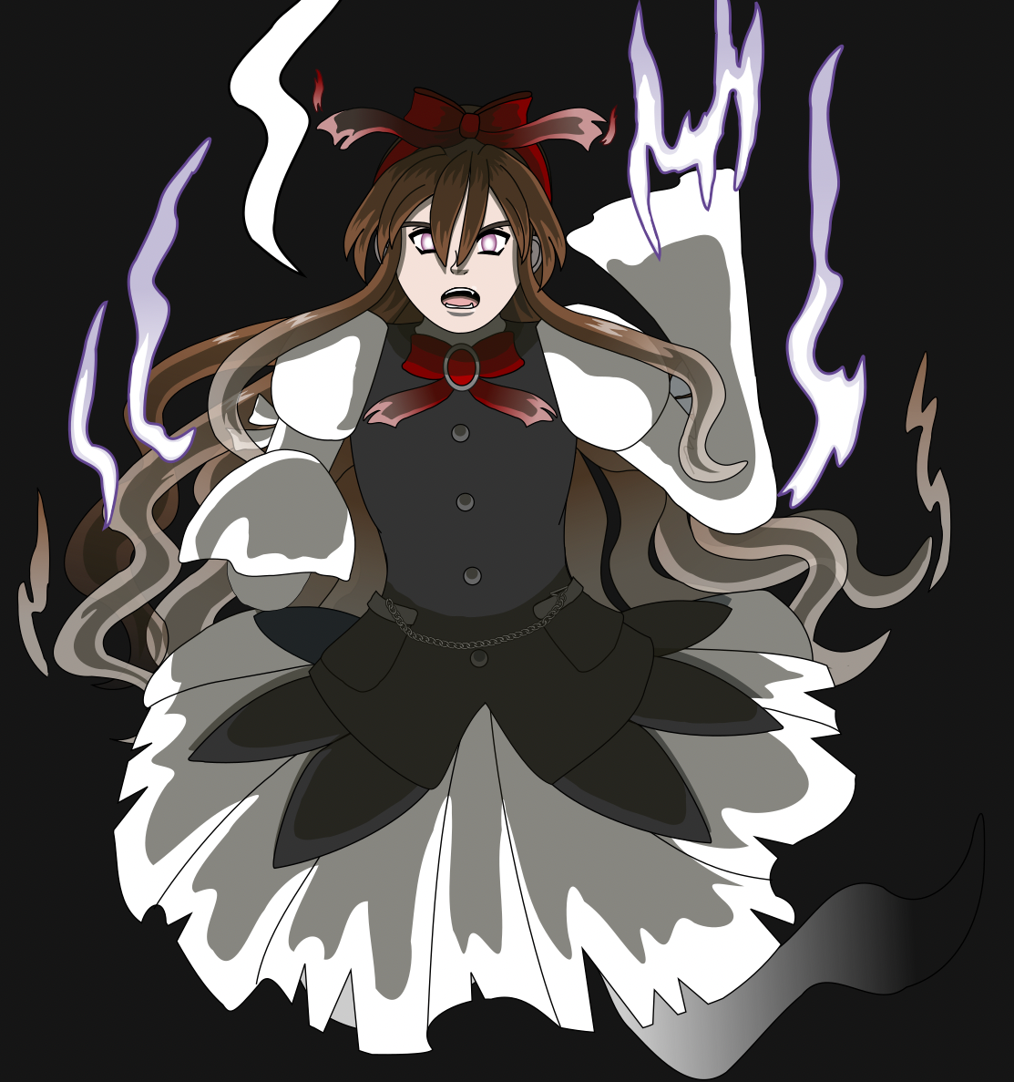
More lighting effects will be added to this panel when the episode is exported into Krita. The shadows were changed to a yellow-orange color to complement the purple lighting effects that will be added. Different color lighting effects are painted in, and they're usually on a layer in the Soft Light mode.
Shaded the next two panels that were vectored, and started this write-up! This will mostly be a compilation of my posts on Mastodon about the challenge with some tweaking.
Shaded 5 panels today, and caught up to the last vectored panel of the episode! Only the last section has panels that have been sketched but not vectored yet, and there are just a few more backgrounds that need to be rendered!
Vectoring those should be the next step, and then to shade them. There will be one more step before I export the episode from Inkscape for the finishing touches; manually adjusting the lineart or stroke width on parts of each panel to give them varying widths.
I considered starting the first sketches for ep. 31 so that some steps of production will start before publishing ep. 30 and reduce time between episodes.
After a little thinking it over, I decided to start the script for episode 31 today! Before I start writing the script for episodes, I write a general outline of events. It's a guideline that the script will expand on and fill in details. Writing the script is also writing how the outline will go from Point A to Point B, and so on to connect them together into a flowing story.
Episode 31 will be adapted from chapter 7 of the previous comic version; those events were moved up to be next, while the next battle which was in chapters 3 and 4 will be moved to that evening or the next day. Since this and the next several episodes will be adaptations, writing the script will be simpler. I'll only need to write it for the parts that are new and the dialogue that will be edited. There will be edits based on new ideas or ideas that were expanded on, which should make the events that lead to Renegade Midnight Conductor crossing paths with Katt seem a *little* less reckless!
Vectored two more panels and started a third. Took a break from them to publish the remaining Magical Renegades drawing and story I did for Sketchtember.
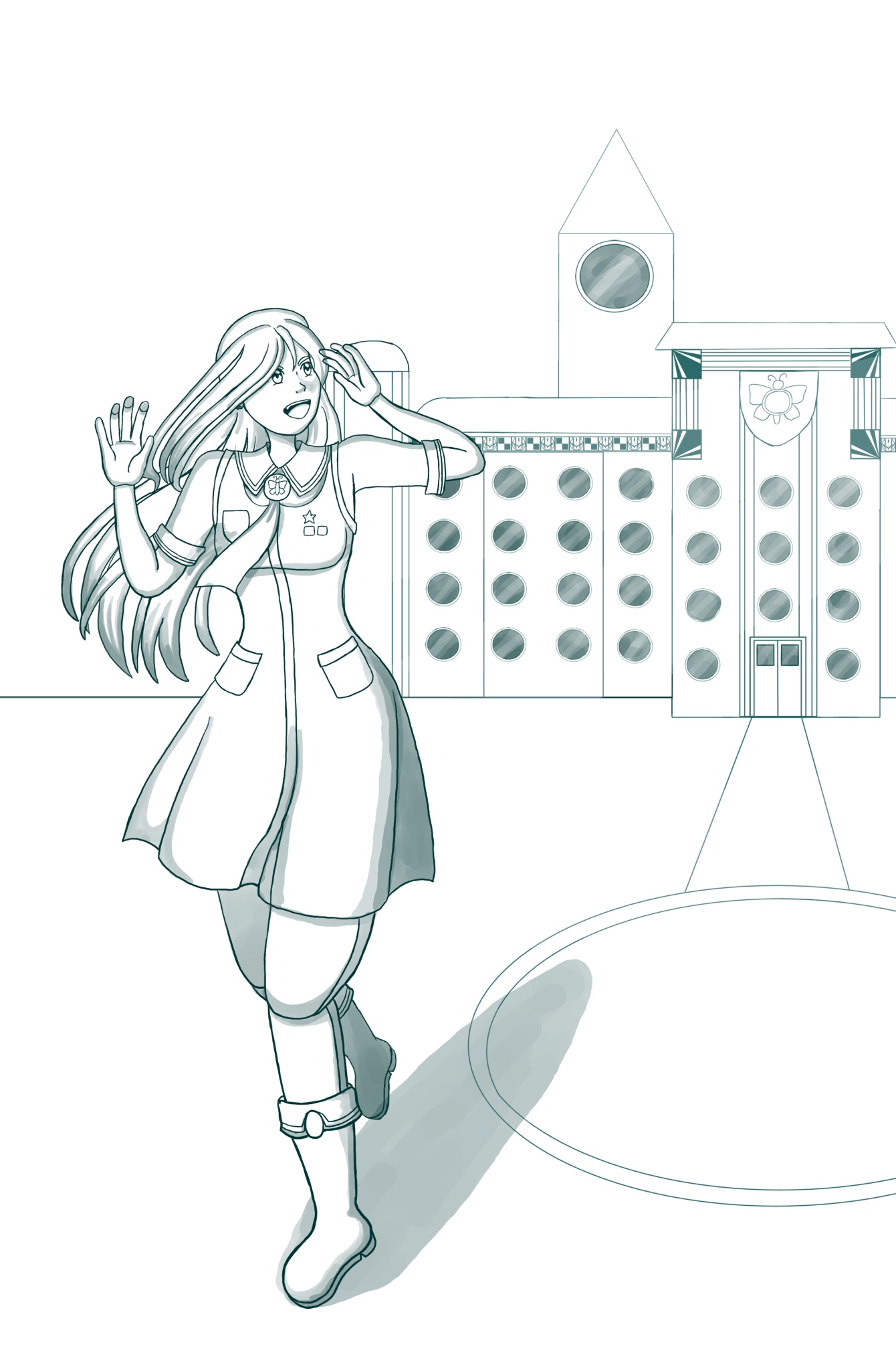
An event in the first timeline that will mark the beginning of the second!
Vectored one of the next panels which has 3 characters in it and rendered the background for that panel. Shaded two more panels that are earlier in the episode because there are some that I missed!
Shaded two more panels near the end of the episode. Just three more need to be vectored and shaded. I’ll also need to manually adjust the widths of the line art on each panel to give it some variation before I export the episode.
Rendered the background of the doors to the auditorium opening for a panel that’ll show a group leaving when the show’s over!
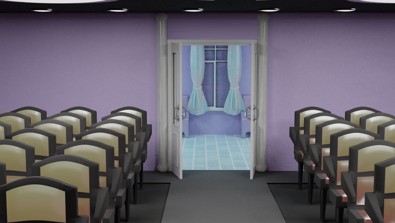
This is for one of the last panels for the episode! Putting in the group will be tricky so I put several modeled people figures by the door in another render of this background to provide a reference for the perspective and scale.
I blended that render and one for another background.
Shaded 3 more panels.
Continued vectoring the panel that shows a group leaving the auditorium, and I'm frustrated because I realize on ep 27, there are bloopers in the crowd scene at the start of that episode! T_T
On episode 5, Katt was shown wearing red leggings, and Alicia was wearing knee-high gray stockings, but they didn't have them in these panels of episode 27!
The group panels in episode 27 are from the previous comic version when Katt and Alicia didn't wear leggings or long stockings with their uniforms. I made those episode 5, but forgot to apply them for episode 27! I went back to make the corrections and update the episode on Tapas.
Before I did, I thought over whether to go back to make the corrections or let this be a blooper to stay to focus on the next episodes. I wanted to keep moving forward but was so annoyed by this blooper that I went back to correct it.
Moving forward, I shaded two more panels for episode 30 and have only one left to go for it! I also expanded on the new parts of the script for episode 31 and sketched the first 4 new panels for it.
Shaded the last panel in episode 30!
I started adjusting the widths of the line art in the panels, and did for most of them today!
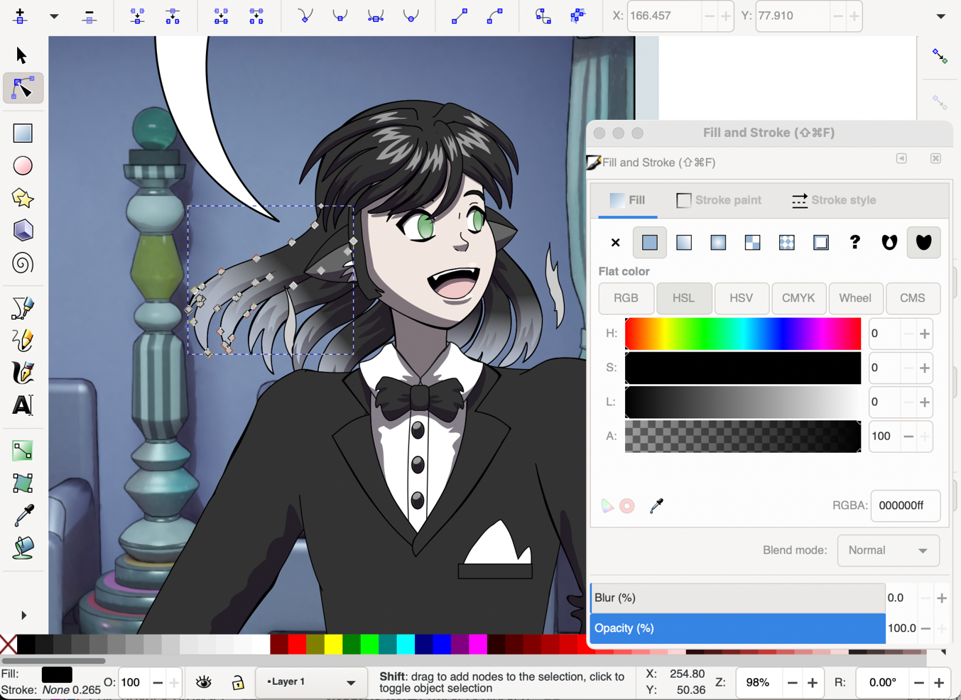
This was still done in Inkscape by duplicating paths and converting them! In this screenshot, part of the hair was selected because it's a path. This'll be an example of the steps. I duplicated it (the fill and stroke) and used the Convert selected object's stroke to paths tool to convert the stroke of it to a separate path.
Converting the stroke kept the fill, but I deleted the duplicated fill since it wasn't needed.
After this, the path converted from a stroke would be moved down in the layer until it was just above the original path. This would be repeated for several paths in most panels.

The buttons to move a selection of paths up or down steps within their layer are the four buttons to the right. From L-R: Move selection to the bottom of the layer, move selection down one step, move selection up one step, move selection to the top of the layer.
Inkscape has keyboard shortcuts for these tools, but they require keys that are only on extended keyboards. Without them, clicking those buttons will work, but can be tedious! This can be changed by customizing their shortcuts in the Preferences.
The finishing touches for episode 30 are near! I finished adding paths to vary the line art width and exported the episode.
I started the finishing touches for episode 30 last night and finished them today! It's ready to publish this weekend!
Just a few more steps to follow:
Spent part of today focusing on finishing the first part of my draft for my page about Magical Renegades. It may be expanded on later, the first version includes:
Published episode 30 today!
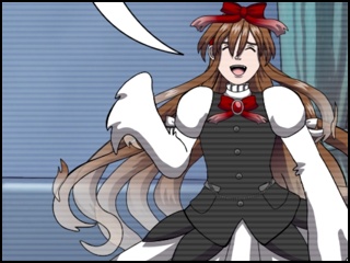
Showtime for the Ghostly Stand-Up Comedians! First Night at the Stranded Inn Time Hotel, Part 3 (of 3) (Link goes to the episode on Tapas)
I vectored some panels that are new for the start of episode 31! A preview:
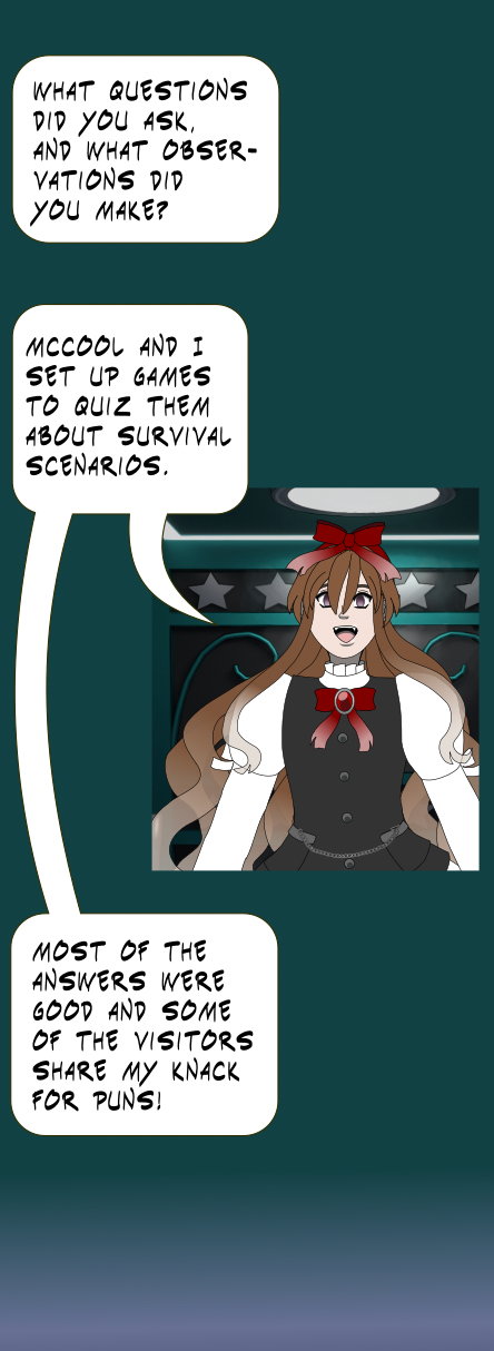
Doing a lot of 3D backgrounds is paying off since this scene in the phone booth reuses background that took hours to model, and several minutes to render and blend!
However, I started to learn how to cel-shade metal textures in Blender so I could render this background again with cel-shading. Learning how to cel-shade other backgrounds could be more efficient and help me skip a time-consuming step to blend the renders, but it wouldn’t be as consistent to have this sudden and noticeable change within the same scene or area.
I could show a comparison of those later before the episode is finished.
Started porting panels from the previous comic version. I’ll need to make some adjustments to them, and this'd be an ideal time to write about this process!
On the .SVG file for the pages I'll be using, I selected entire panels, copied them and pasted them into the .SVG file of the episode. On the episode file, I cut out shapes for the narrower panels into the webtoon background, and moved the pasted panels into the cutouts.
I didn't work on the webtoon today, but published my announcements for episode 30 on 90's Resort, Record Compendium and my Mastodon.art page. I also refined my drafts of new pages for this site!
Update: Episode 30 (Record Compendium)
I'm still focused on completing the first version of the Magical Renegades page for this site, and tweaked the code quite a bit to get the arrangement of the links and buttons on it just right! When I wrote about the steps of the production process, it needed images to illustrate some of the steps. The WIP posts I've been writing paid off because I could use images from those without having to retrace any steps! :D
Participating helped a lot with writing about the production process so I'm very thankful for this challenge for this and to see others' daily progress!
Published this page and others along with the rework of the menu for the home page!
Published this page and others along with the rework of the menu for the home page! I added a new panel and remade 2 with 3D rendering; the close up of the window and the alarm clock.
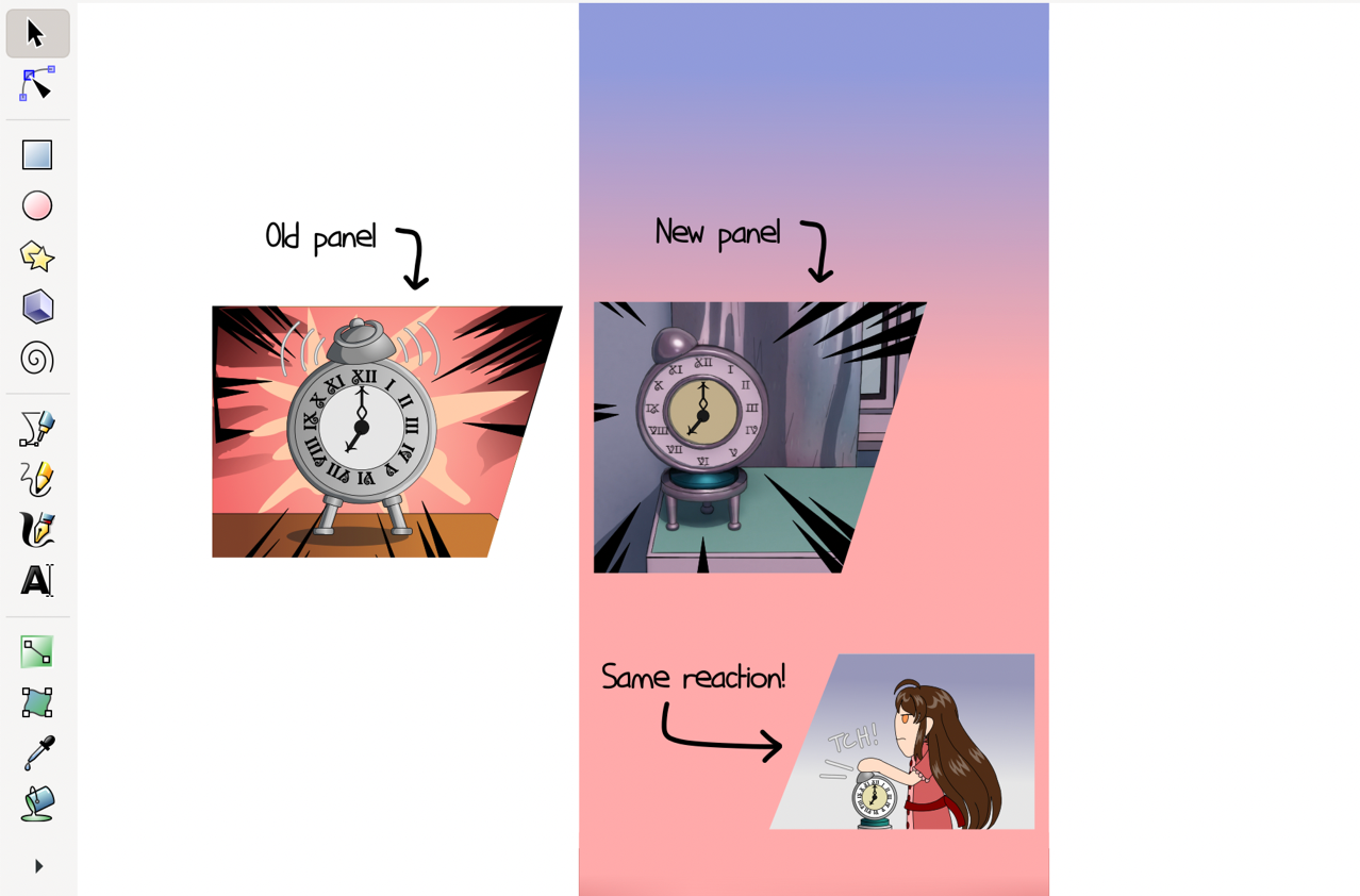
The design of the alarm clock and the drawer changed when I modeled the hotel rooms for episode 28. Was this necessary? I could've just tweaked the original panel with the design changes since that's easy with vectors, but I replaced the first alarm clock panel with a render to keep it consistent. The render also includes the background so it could be an establishing shot within the hotel room.
I also used to manually vector over 3D renders, which perfectly blended them in with the style of the characters and 2D backgrounds, but those were in some ways more tedious. Many of the backgrounds in recent episodes would've been far too tedious to try that with when my update schedule is already slow!
This panel followed the usual steps of manually drawing in the line art and painting over shading to cel-shade it.
Rendered 3 more interior backgrounds and blended them. The panels will mostly stay the same, but I remade some of the interior backgrounds to be consistent with recent episodes. Nothing too exciting now; rendered the front of a hotel room door and it opening!
Most elements of the backgrounds are modeled from scratch, but the windows, doors, stairs and a few other pieces of furniture are modeled with the Archimesh add-on, which is included with Blender. It's extremely useful for these things. When you rotate a door that's made with it, it by default will move the way a door does when you open or close it!
The context to this dialogue: The question was "Are you hearing what I'm hearing?!" after having your door knocked on several times!
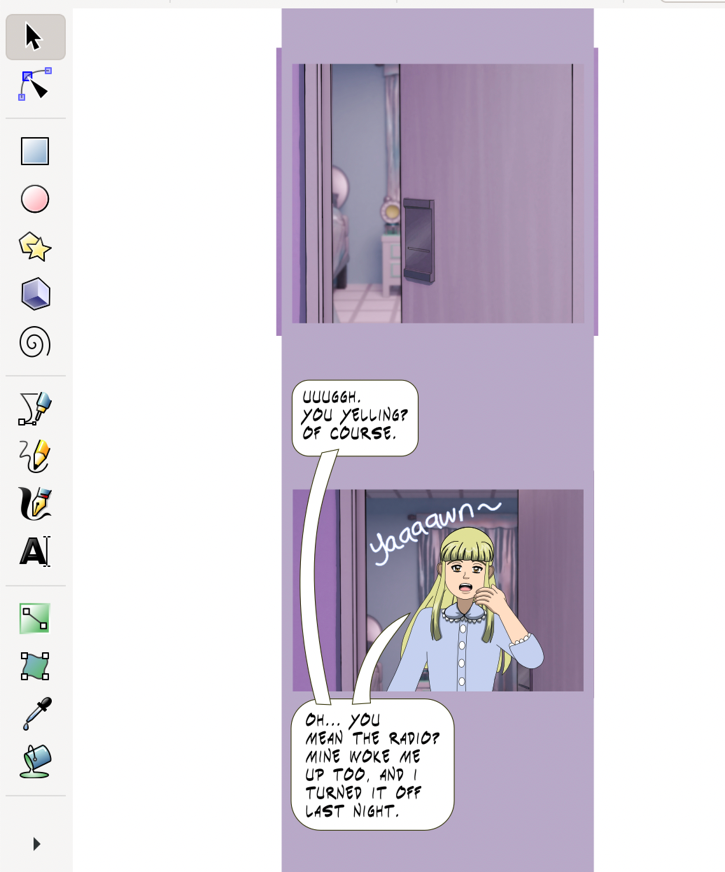
Ported more panels from the previous comic version to the episode! I finished porting the last panels from page 163 and started porting them from page 164. The dialogue in both of these pages will be kept, but I'm adding a few extra panels between shots to fit the flow of a webtoon.
I've observed that between a comic page and a webtoon segment that cover similar actions and dialogue as each other, the page is more compact and the webtoon segment may draw out the scene with extra panels.
This is another reason why the Magical Renegades episodes that adapt previous comic pages aren't 1:1 adaptations. I had the chance go to back and fill in more details and important scenes that should've been there, but space is also at a premium on pages, so panels have to be boiled down to the essentials and arranged in a way to convey enough that they're easily readable and keep readers interested to go to the next page.
Webtoons focus on scrolling and tend to have more panels of in-between scenes which gives them more of a similarity with animation. The extra panels I'm adding for this episode are in-between scenes, and the panel that showed the door opening from yesterday's WIP is one of them.
Ported the rest of the panels from page 164 and added an extra panel that shows a close-up of Claudia's pocketwatch. She needs it for battle, but it's not her pocketwatch that can tell the time! The perils of magical transformation devices that look like other functional items!
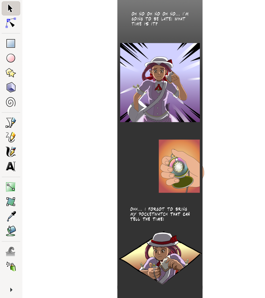
My last update for this challenge isn’t too exciting, but I adapted a few more panels into episode 31. I realized I needed to tweak the anatomy on them, and although it's easy to fix it up with vectors, it can still be tedious since I also needed to re-do a lot of the shading on those panels!
This was a simple challenge I found at the start of the month, and it was great sharing my progress, and other creators sharing theirs on Tapas! AFAIK, this challenge was widespread on Instagram, but may not have spread to Mastodon; I didn't see any results when I searched for the hashtags it uses on Mastodon, so I may have introduced it there!
The writing that I did for this challenge throughout the month also helped me write the production process section of my page for Magical Renegades! That page was in-progress, but it was stalling because writing about the process was a hurdle. The daily progress I wrote about for this challenge and my commentary about the steps let thoughts about the production process were fresh in my mind, which made writing about it a lot easier, and words could flow from my mind and onto the keyboard with a lot less effort!
Writing about this challenge and publishing two more pages also made my home page, this site at the index, stand on its own more. I launched it and 90's Resort almost a year ago, but 90's Resort had nearly all of the focus since it's for my largest project.
I'm very thankful for Comics Challenge, and finding it!