90's Resort is a Magical Renegades spin-off that celebrates the Old Web experience and aesthetics!
It adapts most of the material from the Magical Renegades supplementary material blog Record Compendium, but in the style of the Old Web! It should have less overhead so it should load better on older computers and OSes. A Neocities site is also a more fitting to host pieces of pixel art and 3D renders!

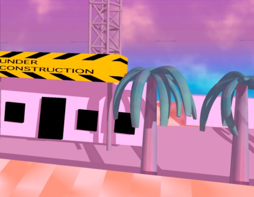
Don't mind the Under Construction signs! This site has been built onto since its launch, but there's a construction site left here on purpose as an homage to those Under Construction pages from the old web!


*ahem* On with the tour!
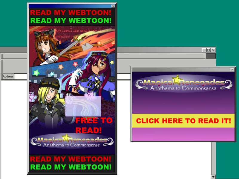
The aesthetics and the customizability of the Old Web era are great, IMO, though there are some aspects that should be left behind like sites only working in specific browsers, or flashing pop-up ads!

So don't do this!
Record Compendium hosts the supplementary material and lore. It was created because Tapas doesn't give the option to create extra pages, so an external site was needed. Record Compendium launched in 2017, but began to find its footing in October 2018. It became a repository for Magical Renegades lore, but because it's curated and I'm trying to keep it neatly organized, not every art or writing idea that was tangentially related would be a good fit for it.
Ideas gathered like a growing collection of knick-knacks on a dusty shelf. Their only chance of being brought out for display was "when the time was right", but when would that be? After the next announcement of an episode? After they could be fit in with a story? I could never feel sure. Ideas on my to-do list, either one I wrote down or the one I try to keep in my mind, kept building up.
The perfect opportunity struck in early 2021: I was introduced to Neocities!
How could these grounds for personal sites that encourage the fun parts of the Old Web elude me? That could be a tale for another time. I saw the rise of the walled gardens of large social media. Websites looking more samey. They had a cleaner and more polished look, but looked more similar to each other. There was less room to experiment with designs. Personal sites, and a few old-school webcomic hosting sites remain, but they were being seen more as relics of an old era. That was usually said in a negative way, like they were an outdated format that no one would want to keep using. If that were true, there'd be no interest in old tech, nor would vinyl records have a resurgence!
Before I laid out the groundwork for 90's Resort, I lurked around for inspiration, and was inspired! So much creativity and people having fun designing their webpages! These sites looked like the sites I remember with a few modern twists that the current state of the web, such as the commentary against modern social media's ubiquity.
Sites in the style of the Old Web were still around with a thriving community that kept up with the times by reminding people there are alternatives to the corporate-dominated mainstream social media, and that designing sites from scratch can be fun!
As a visual person, I sketched page layouts before I began coding them. Rough sketches of how tables would be arranged, and the text and images within them. After the layouts were sketched, I scrawled HTML tags and values to the side.
The most complex page of 90's Resort is the index, which I made a mock-up of the layout and content for in Inkscape before I began coding. Resizing, moving, or changing the color of anything was easy, and this was just what I needed. After I mapped out the color schemes of the styles that would be used, I was ready for the next step!
While I was coding, or sketching, I'd jot down ideas for more material, and for pieces of art to decorate the site. Those ideas could come up at any step of development so it was always valuable to keep a note-taking program within reach! Development usually hasn't been a linear process!
The development began in May 2021, and launched on November 15. See The News Stand for a behind the scenes look at the development process. The posts before November 15th are from before the launch, and give glimpses into the process, of development hell, and breaking free from it!
Coding also had its tribulations. See the next section for more about that!
Coded in HTML 3.2. No JavaScript. 100% hand-coded!
This site would qualify for the 100% Hand Coded HTML club!
I didn't intentionally strive for this, but when none of the WYSIWYG editors I tried that should've been compatible worked, and all I had was a text editor, I made do with what would!
It was an ordeal, carefully looking through the code to spot errors and fix them each time! @_@ This wasn't on Neocities' built-in editor with its color-coded text and features that are helpful for spotting errors! This was in TextEdit so I had pages ready in advance to upload to Neocities!
The lack of JavaScript is because I never learned it, but not using keeps the sizes of the pages down. If I were to use JavaScript on any pages, I'd want it to have a purpose.
It's simpler than the workarounds in CSS! I get the rationale for the center tags being deprecated in favor of CSS to center text and images, but simplicity wins out this time.
While I kept coding from scratch before the launch, I wanted to make the best of this challenge. The minimalism of coding in a text editor is quite nice, even without the helpful features. This was daunting, but it felt worth it!
I've used Bryce, Blender 2.7 - 2.9, Infini-D 3.0, and Ray Dream Studio 4.
The 3D renders here that look like they're from the 90's were made with a program from the 90's! Unless I mention otherwise, the 3D renders on here were made in Infini-D 3.0!
Blender is the only one of those programs that is modern. I tend to like modern software that is FLOSS, but I disliked using this before 2.8. That version overhauled the UI, and it has been a much better experience since! I could still use it here for retro renders, if I can replicate the feel and quality of it from the 90's.
I only recently tried out Ray Dream Studio, and had no tutorials to help me get started, but most of the controls were easy enough for me to figure out without using one! Haven't used Bryce in ages, but I want to again. Bryce and Infini-D were the first two 3D programs I used.
Krita for my modern program, and Claris Brushstrokes for an older program in color, and MacPaint for an older program in black and white! The computers in the Keep older computers useful buttons were made with Brushstrokes.
Supplementary material is fun! Since I'm hosting Anathema to Commonsense on Tapas, which doesn't support extra pages, the supplementary material needed to be hosted somewhere else. Record Compendium launched on Wordpress years before 90's Resort as the site for it.
Wordpress was the best balance between customizability and convenience I knew, and I've stuck with it. No coding required. All that needed to be designed were the header and logo, though the site recommends the use of featured images. A background image could be added but was optional, and I chose a theme that lets me change several colors. It's quick and easy, and offers more customizability than modern social media offers which is often little more than a custom header and profile picture.
90's Resort is an adaptation, but isn't a 1:1 mirror that's just on static web pages although it could've been one. That would've been a lot faster, easier and practical with my update schedule, but there was a deliberate reason I took a much longer path.
Generally, my philosophy is based on balancing passion and pragmatism.
Passion through keeping a project fun helps keep it going! When I launched Record Compendium, I didn't have much direction for it, and I quickly became bored. It felt like an afterthought that I wasted time on until got its footing in October 2018 with the first of the art challenges that had stories written with them. They make up The Scattered Archives, and explored ideas and events that happened in the timelines that are featured, and gave more glimpses into the lore.
This was fun and spontaneous and gave more of a purpose to Record Compendium with passion that could be channeled into writing and drawing for it! It was an opportunity cost to create supplementary material, but it felt worth the cost this time.
Passion is more broadly, having fun with a project and making it fun!
Everything has an opportunity cost. Do one thing and you take time and effort away from other things that could've been done at that time and place.
Pragmatism is the principle that everything should have a purpose, and nothing should be an afterthought. This is the calculated side. It keeps ideas manageable, but when it's excessive, it can lead to boredom and can drain passion and fun. Draining those can stop the momentum and grind a project to a halt.
When pragmatism is balanced, it's a creator thinking about what's worth their own time while they consider the viewers' experience and what would be worth their time.
90's Resort isn't a 1:1 mirror because it's a better viewer experience for material that's adapted to different formats and platforms to fit each of them. Would you want to use an image-centered microblogging platform to repost long-form articles section by section? Probably not! ^^;
Each platform that is used should contribute something. In corporate speak you may hear of a service contributing "added value", and despite my use of corporate speak, I miss how the old web was a lot less profit-driven. It was a lot more expressive and fun, but as the web became more commercialized, it prioritized convenience and standardization.
Wordpress as a platform was the best compromise I knew since I still wanted some customizability, but I launched Record Compendium with the mindset that I just wanted to get supplementary material out there as to not take too much time away from everything else. That's not bad by itself, but convenience comes at a cost we should be aware. Even if mainstream social media weren't rife with data collecting that makes users the product to sell ads, less customizability becoming the norm leads to fewer forms of self-expression, and a web that has become so samey and boring!
Both sites I use can be complementary to each other and fill different niches. The old web and the sites that continue it like the sites on Neocities sites are a lot more spontaneous, and the experience viewing them is so unlike the modern web. It's a lot of fun to look at sites created by people who share their interests and design skills in one place, and in their own styles! It's fun to be able to create a site and share those ideas and skills, and they don't need to be curated like blogs and social media feeds are expected to be. Personal sites from the old web were someone's corner of the internet to share their ideas!
Old web aesthetics have a charm to them I'm fond for, but I couldn't fit them anywhere until I chose Neocities as another platform to adapt material. Developing this site was an opportunity to design one in the style of the 90's web to post some retro art more freely, and create a site that uses fewer resources so it'd load better on older devices.


From personal experience I had a smartphone that was very usable for browsing the web. It's from 2010 and was an older phone when I got it, but it still worked perfectly until some websites no longer loaded on it. I tried to not let that bother me, and would wait until I was at my computer to view the sites I couldn't on my phone, but more sites would stop loading. The bloat of the modern web leaves older devices behind, and it's worse for smartphones! Computers that are as old as that phone can at this time still be able to browse modern websites.
Sites in the style of the old web can be flashy and expressive but take up a lot fewer resources!

