

The Magical Renegades project site (still sometimes known under its original name of Magical Renegades 90's R e s o r t) is one of the hosts of material for this project, but also designed to celebrate old web aesthetics and philosophies.
It adapts most of the material from the supplementary material blog Record Compendium. The creation of this site also has a pragmatic reason; It should have less overhead so it should load better on older computers and OSes. A Neocities site is also a more fitting to host pieces of pixel art and 3D renders.

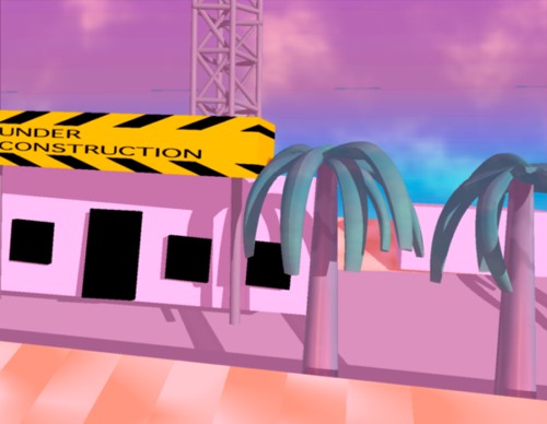
Don't mind the Under Construction signs! This site has been built onto since its launch, but there's a construction site left here on purpose as an homage to those Under Construction pages from the old web!


*ahem* On with the tour!
The Library section of the index page lists each of the stories.
The Museum is a newer addition after the site had a major remodel and archives several pages:
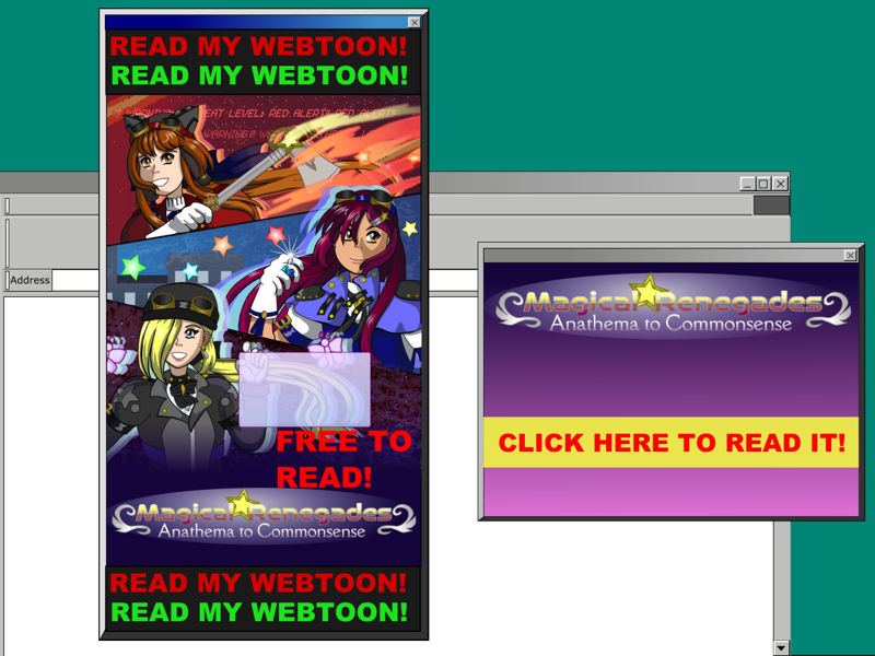
The aesthetics and the customizability of the Old Web era are great, IMO, though there are some aspects that should be left behind like sites only working in specific browsers, or flashing pop-up ads!

So don't do this! That strategy wasn't liked even then.
Record Compendium was created because Tapas doesn't give the option to create extra pages, so an external site was needed. Record Compendium launched in 2017 on Wordpress, but began to find its footing in October 2018. It became a repository for Magical Renegades lore, but because it's curated and I'm trying to keep it neatly organized, not every art or writing idea that was tangentially related would be a good fit for it.
Ideas gathered like a growing collection of knick-knacks on a dusty shelf. Their only chance of being brought out for display was "when the time was right", but when would that be? After the next announcement of an episode? After they could be fit in with a story? I could never feel sure. Ideas on my to-do list, either one I wrote down or the one I try to keep in my mind, kept building up.
The perfect opportunity struck in 2021: I was introduced to Neocities; I like its philosophies and what I saw inspired me to challenge an old belief I had. That was although I liked the idea of making a customizable website, I didn't think I could because I feared it'd take too much time away from working on the webtoon episodes to slow down updates further.
I realized that they didn't need to be at odds with each other, but that they could complement each other. I designed this site to be an adaptation of MR and a different viewing experience, and the complete customizability offered by Neocities allowed that.
I began with sketching page layouts. Rough sketches of how sections would be arranged, and the text and images within them. A lot of the graphics I made for the site date back to this time; I made several pieces of pixel art in Krita and ported over 3D renders I made with Infini-D 3.0
At that time, I wasn't very proficient in Blender but I also chose to use a 3D modeling program from the 90's to make retro graphics. It was one that was also easy enough for me to learn the basics without the manual.
Before I began coding the front page, I made a mock-up of the layout and content in Inkscape. I could easily resize or move areas or changing the color of anything. After I mapped out the color schemes of the styles that would be used, I was ready to start coding. While I was coding, or sketching, I jotted down ideas for more material, and for more graphics to decorate the site. Those ideas could come up at any step of development so I always kept a note-taking program within reach. Development usually hasn't been a linear process.
Development might've began in May 2021 when I found out about Neocities and started coming up with ideas for the site. In June, I continued brainstorming and started making some graphics. Development rapidly took off in July; several of the graphics on the site during launch, and several of the pages that were included in the launch were created that month.
I put together The News Stand page in mid-August to document more about the development process. In August, I wrote a lot and made more graphics. However, it started to get into development hell that month due to my perfectionism. It was close to being ready to launch. In the middle of September, I said the site was almost ready to launch but declared it almost became vaporware.
During the month I had a breakthrough and development steadily continued. I created my Neocities account and put together an index page on 7 Nov 2021, and launched the MR site on the 15th.
Coding also had its tribulations. See the next section for more about that!
No JavaScript. 100% hand-coded.
This site would qualify for the 100% Hand Coded HTML club!
I didn't intentionally strive for this, but when none of the WYSIWYG editors I tried that should've been compatible worked, and all I had was a text editor, I made do with what I had. I walked both ways in the snow and liked it.
It could be an ordeal to carefully look through the code to spot errors and fix them each time, but I tried to be diligent. I type it all out in TextEdit and then paste it into Neocities' editor which checked for errors that I missed.
The lack of JavaScript is because I never learned it. I see some practical use for it here, but not using keeps the sizes of the pages down.
When I began this site, I shamelessly used center tags when centering content. I had an interest in sticking with an older HTML version for its simplicity, but I also wasn't patient enough to learn how to center images with CSS because I prioritized getting this site out of development hell. Using a table for the layout of the front page for a long time was also a questionable decision, but it was meant to be a retro choice. When I designed this site, I wanted to base it off parts of the 90's web experience and table-based layouts were part of that!
I knew that was impractical and harder to maintain, but accepted it as a cost to pay for the 90's web experience. Gradually I learned more of the benefits of HTML 5 features I missed out on learning. Eventually, practicality won out leading to the remodel of the site. By the time that happened though, there was a lot of clean-up of outdated code that needed to be done that could've been prevented.
This site began as another place to host spin-offs and supplementary material since I couldn't easily host the ATC episodes here. I briefly attempted to do that by posting a webtoon episode or two on here, but it wasn't seamless. I gave up on that and started adapting the ATC episodes into a webnovel format so they could easily be hosted here.
About half of the episodes were adapted until it stalled, but this was a step forward in bringing the main story to the site so it no longer had to be just for the spin-offs. With that, I aimed to give readers the option to view everything on one site than going between them, and to make the webnovel chapters as detailed as the episodes they adapted.
Continuing MR as an illustrated webnovel through Polished Diamonds Culmination also tied into these goals.
Magical Renegades in any form went on hiatus through most of 2025. Along with the plans to relaunch it were plans to revamp the front page with modernized code and a div grid layout. I started with the front page before expanding to other pages. As of writing this, clean-up is in progress to remove outdated HTML from all of the main pages.
During that remodel, it also felt like the right time to split the update archive pages into multiple because of how long they got. Since the remodeled front page doesn't have as many 3D renders on it as the earlier layout, the 3D Renders page is planned to be made to showcase them.
I wanted to write a Cast page during the webtoon and drafted one, but never got to publishing it. With a fresh start, writing a Cast page feels a lot easier so one is planned.
If there's just one piece of advice I could give for someone who wants to make a comic, webtoon, novel or anything else it'd be "Have fun, but also make sure the writing and drawing process is sustainable for yourself."
I learned this the hard way multiple times 🙃 Magical Renegades' history is rife with this! The webtoon which ran from 2020-2024 adapted a webcomic that got discontinued in 2019. I started it over as a webtoon because I liked the format though there was a trade-off.
Pacing problems can be the downfall of a project. Near the end of the comic version I got bored because of pacing problems. All of the pages I needed to make to get to the next major plot point felt like a chore.
I didn't have that issue with the webtoon version so much, but it got discontinued due to an unforeseen circumstance; continuing it in that format eventually became unsustainable for me. Each episode had a lot of steps in the production process and the update schedule was once a month at the most. Pacing became a problem again because of how long it took for each episode to be published.
This was a slower schedule than I hoped it'd be, but I still had my eye on the goal for years and knew that I'd keep going, getting to where I hoped to one day if I patiently kept up the process. The WIP Archive and Production Notes pages through 2024 are demonstrations of this philosophy.
Magical Renegades has always been a solo project so its format is based on what I can do and sustain alone. However, the process for making webtoons that was working eventually became too much for me to continue, but a monthly update schedule also wasn't cutting it for me anymore.
What can I say now? When resources are limited with a solo project (time to draw it, money, etc.), I'm prioritizing efficiency but still want to make it fun to keep working on. Prioritizing efficiency is prioritizing which way may be easier but more enjoyable for a creator to convey their ideas and plays to their strengths. This'd be finding what works best for you. It can be through novels, novels with illustrations, comics, webtoons, a worldbuilding wiki, a game series or something else!
This is like why I wanted to make comics in the first place. I wanted to draw and tell a story, but drawing felt like more of my strength than narrating for a novel. Times changed, and I changed that it's now more efficient for me to write novels with illustrations to supplement the writing, but this core philosophy hasn't changed.
Before I continued MR as a webnovel, I already had experience trying the illustrated webnovel format that worked well at a steady pace. It's bittersweet that I can't illustrate as much as I used to, but what I used to dread about narrating for novels became an opportunity; plenty of background details can convey the atmosphere I intend even if I don't get to illustrating them.

